How to get more from B2B display: sharper messages, human-centred design, trust and the right environment.
In B2B advertising, reaching the right company is only half the job. The other half is getting a busy decision-maker to notice your message, understand it and remember it.
B2B Programmatic lets you put banners in front of carefully selected organisations across the open web. But targeting can’t save a weak ad. Your banner sits next to an article someone actually wants to read, and it gets a second or two of their attention, if that.
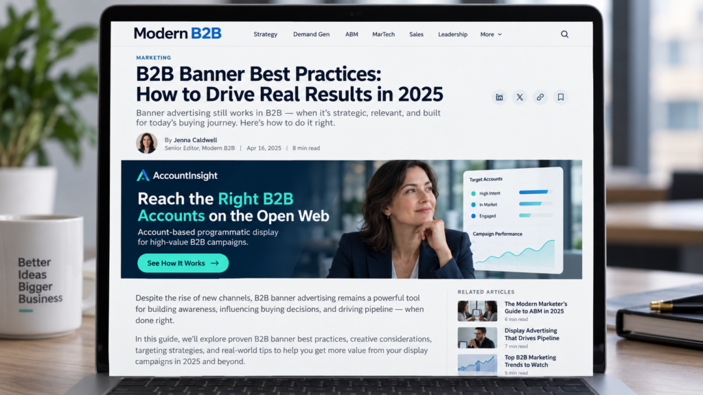
So what makes a B2B banner work? Here are ten principles, drawn from research on attention and advertising effectiveness and from what we see running account-based campaigns every day.
1. Test the message, not just the design
Most banner tests change the colour, the image or the button text and leave the message alone. Yet the message is often the variable that matters most.
Take AccountInsight itself. The same offer can be sold four quite different ways:
| Approach | Example headline |
| Solution-led | Reach the Right B2B Accounts on the Open Web |
| ROI-led | Turn Media Spend into Account Engagement |
| Risk-led | Stop Wasting Budget on the Wrong Audience |
| Trust-led | Built for Transparent B2B Advertising |
A marketing ops manager may care about what the product does, a CMO about results, someone in finance about wasted spend. Which message lands depends on who you’re talking to and where they are in the buying process. These four are examples, not proof that one approach beats another. But testing them against each other will usually teach you more than four shades of the same banner.
2. Make the message instant
People rarely visit a page for the ads. Nielsen Norman Group has documented banner blindness for years: readers skip anything that looks like advertising, even in prominent spots. If your banner can’t be understood at a glance, it probably won’t be understood at all.
So keep it to one message, one supporting visual, a visible logo and one call to action.
Static banners do this well, because everything is on screen the moment they load. Animation has its uses, such as showing a product in action or catching the eye on a busy page. The risk is sequencing. If the headline arrives in frame two and the CTA in frame four, someone who scrolls on after a second only sees your logo. Keep headline, brand and CTA visible throughout and let the motion happen around them.
A word of caution if you compare the two. Static banners hosted in the ad platform and HTML5 banners served by a third party often track clicks differently, so a gap in click numbers can be technical rather than real. Check the set-up before you declare a winner.
3. Build trust before you ask for anything
Enterprise buyers aren’t just comparing features and prices. They’re also weighing implementation risk, whether the supplier will still be around in three years, and what happens to them personally if the choice goes wrong. Good B2B advertising helps reduce that uncertainty.
In January 2026 the IPA published an analysis of 812 campaigns from its Effectiveness Databank. Of the for-profit campaigns that reported very large gains in brand trust, 93% also reported at least one very large business effect, compared with 66% across all for-profit campaigns. The databank isn’t about B2B display, and a trust message on a banner won’t automatically deliver the same. Still, it shows how much credibility counts.
On a banner, trust comes from specific evidence (a result, a customer, a claim you can stand behind), a brand people start to recognise, relevance to their industry, plain language, and a landing page that delivers what the ad promised. “The world’s leading solution” tells a buyer almost nothing. A precise, checkable statement does far more.
4. Show the outcome, not just the product
B2B ads lean heavily on dashboards, screenshots, servers and abstract tech imagery. They show what you sell, but not what it’s like to use it.
People can help here, if they’re used well. In a 2014 eye-tracking study published in Frontiers in Psychology, Pitch Sajjacholapunt and Linden J. Ball found that a face looking towards the ad’s text drew more attention to that text and improved recall of it. When the face looked straight out at the viewer, attention tended to stay on the face. A person looking at your headline helps; a stock portrait smiling at the camera may just compete with it.
Copy works the same way. Buyers are professionals, but they also want to look good, avoid mistakes and get home on time. “Automated reporting and analytics” is a feature. “Spend less time preparing reports” is a business benefit. “Walk into your next board meeting with confidence” is the human outcome. Each has its place, and the strongest messages link the business benefit to what it means for the person signing off.
5. Match the ask to the buying stage
Some of your target accounts have never heard of you; others are already shortlisting suppliers. They need different messages.
Early on, talk about the problem and offer something useful: Read the Report, Explore the Research. During consideration, show capabilities and use cases: See How It Works. Closer to a decision, get specific: Calculate Your ROI, Compare Options, Book a Demo.
Asking someone who doesn’t know you to book a demo is asking a lot. A smaller first step usually feels more natural.
6. Stand out from the page
Business news and trade sites tend to be white and clean. A white banner without a border can melt into that layout and lose its edges. Give it contrast, whether a brand colour, a darker tone or a clear frame, so it reads as a separate unit. Dark isn’t automatically better, though. What you want is clarity.
A few practical points. Use bold, simple type, because thin weights and pale grey wash out on many screens. Check every size on its own: a layout that breathes at 970 × 250 may be cramped at 300 × 250. Make the CTA look like a button so nobody has to guess where to click. And resist adding a second image or a third benefit. Every extra element weakens the main message.
7. Give the campaign room to deliver
A programmatic campaign can only bid on a placement if it has a creative in the right size. Miss a common format and that inventory is simply out of reach. When you’re targeting a fixed list of accounts, every lost opportunity reduces coverage.
So supply a full family of standard sizes for each creative. The most widely used are:
| Size (pixels) | Format |
| 300 × 250 | Medium rectangle |
| 728 × 90 | Leaderboard |
| 300 × 600 | Half page |
| 160 × 600 | Wide skyscraper |
| 970 × 250 | Billboard |
| 320 × 50 | Mobile banner |
It also helps to have several variations per segment, for example by industry or account tier. You can then tailor the message and learn what works without wearing out a single design. And keep file sizes light so the banners load quickly everywhere.
8. Don’t write off desktop
Mobile gets most of the attention, but enterprise buying isn’t consumer browsing. People researching a solution read industry news, go through technical documentation, compare vendors and work through procurement, usually on a laptop at their desk.
That gives desktop banners some advantages. There’s room for a clear headline, a strong visual and a line of supporting copy. Larger formats give the brand more presence on screen. The ad appears next to content the reader chose for work reasons, which may connect with a problem they already have. And if they want to go further, a white paper or a demo is easier to explore on a big screen.
Microsoft Advertising’s September 2025 Desktop Performance Report found desktop conversion rates 52% higher than mobile. That comes from a different advertising context, so it doesn’t prove desktop B2B banners beat mobile by the same margin. But it points the same way.
Mobile still has a role for reach and repeated exposure. Desktop is a significant part of how we run campaigns at AccountInsight, because the value of an impression depends not only on who sees it, but on where and when they see it.
9. Stay recognisable, and refresh when the data says so
Most companies your campaign reaches aren’t buying right now. The 95:5 rule from the LinkedIn B2B Institute and the Ehrenberg-Bass Institute puts it plainly: at any moment, only a small share of potential buyers are in market. Your advertising has to build memory for later, not just prompt a response today.
Familiar colours, type, logos and visual elements help people recognise you over repeated exposures. But showing exactly the same message for months wastes the chance to say anything else. Keep the design system and rotate what’s inside it: a solution message, a business outcome, a customer story, an industry-specific challenge.
There’s no magic number of weeks after which a banner wears out. It depends on frequency, campaign length, audience size and saturation. Watch engagement at account level, and when it starts dropping among accounts that have already seen the ad many times, bring in something new.
10. Measure more than clicks
Click-through rate is useful, but it misses a lot. Someone can notice your ad, remember you and visit your website a week later without ever clicking. And a banner that gets plenty of clicks isn’t necessarily reaching the accounts you care about.
For account-based campaigns, look at:
- reach and penetration across the target account list
- viewable impressions and frequency per account
- website visits from target companies before, during and after the campaign
- repeat visits and engagement over time
- interaction with relevant content
- opportunities and pipeline, where you can reliably link them to the advertising
When you test creative, change as little else as possible and check that tracking is consistent across formats. Otherwise you may credit the banner for a difference that really came from the audience, the placement or the landing page.
Better targeting deserves better creative
Programmatic lets you reach the companies that matter most. Finding them is the start; the banner still has to give them a reason to look.
Test genuinely different messages, earn credibility, speak to what the buyer cares about personally, and choose environments where a proper message can be seen and read. What works for one audience won’t necessarily work for the next, so form a hypothesis, test it, and measure the effect on the accounts you’re targeting.
At AccountInsight we run account-based programmatic campaigns as a managed service. We reach your target companies across the open web, take care of creative set-up and tracking, and report delivery and engagement company by company.
Reaching the right company creates the opportunity. The right message makes it count.
Pre-launch checklist
We upload your creatives, set up tracking and launch the campaign. Before you send us your banners, check:
- Do your variations test different messages, not just different colours?
- Are headline, logo and CTA visible as soon as the banner loads?
- Does the image support the message rather than decorate it?
- Does the banner stand out on a white page, with crisp type and a button-shaped CTA?
- Are the files light enough to load fast?
- Does the landing page continue the banner’s message and look?
- Are fresh variations ready for when engagement drops?
- Have we agreed which account-level metrics will define success?
Book a call with one of our B2B Display experts to discuss what banners will be most effective for your next B2B programmatic campaign.